• Acela II (Alstom Avelia Liberty): Design, Production, Delivery, Acceptance

  • Discussion related to Amtrak also known as the National Railroad Passenger Corp.
Discussion related to Amtrak also known as the National Railroad Passenger Corp.

Moderators: GirlOnTheTrain, mtuandrew, Tadman

  by photobug56
 
Studies done amazingly enough by LIRR in the late 90's show greys, blues were preferred. So we move forward, and we concentrate on comfort (and avoiding crazy colors), and things that make the trip easier. Easy ability to plug in both laptops and phones / tablets (people tend to bring their own entertainment), super reliable wifi with decent speed and capacity, good work tables and good ability to nap, noise absorbance, decent info signs on where you are, speed, what's next. Hand holds on aisles. Good, clean bathrooms. Far better food options outside first class. And due some consumer tests before locking down designs.
  by SouthernRailway
 
Matt Johnson wrote: Fri Apr 17, 2020 7:55 pm I agree that most riders won't care so much about external appearance. Interior might be another matter, but I'm not sure how much it matters. I prefer traditional, subdued - blue & gray colors, maybe some woodgrain finish. So, I find the first gen Acela to be perfect in that regard. The new one definitely goes for more of a rainbow effect! Orange and purple is definitely not my first thought when I think of first class accommodations. Looks too commuter train-ish to me, but again, I'll have to see it in person.

https://railcolornews.com/2019/08/29/us ... or-amtrak/
I agree and look at the cafe car: it literally has a wall that is covered in a vomit design.

The interior colors are not classy. Subdued blues, grays and dark wood are classy.

Surprising that the same railroad that has those beautiful new Viewliner dining cars has this. (I know, look at what Amtrak has done with the Viewliner diners, but they are beautiful.)
  by photobug56
 
I don't remember the Vomit walls in the cafe car. What I do remember. Going in the cafe car and either no one was ready to start nuking burgers or handing out bottles or cans. Then once they were, a long line of people waiting for their nuke burgers and soda or juice bottles. Generally slow service, food that you can tolerate once, say on your outbound trip, but which you want to avoid on the way back. Food that does not encourage you to take another Amtrak trip anytime soon.

Back in the 80's, I took one of the Silver's down to Florida, pure coach. I remember how wonderful the food was, how nice it was to meet people while eating, and how much I looked forward to the train home when that time came. I know, different types of trains, but the food is a huge part of what I remember. And the food I had on Acela was pretty bad.

I've read discussions on having the food being an outside service. Nothing against the Amtrak crews, but I'm guessing that even Acela NY to DC having a good lunch (you can take to your seat or sit in the cafe car to eat) or good breakfast or dinner or snack going over well and making money. For instance, a morning run, a good diner style breakfast.
  by gokeefe
 
Those interior shots are magnificent. Really high resolution too. They look great. I like the split leaves on the tables.

For color comparisons take a look at the Acela interior shots on the internet right now. This is a major upgrade. Lighting is improved substantially due to the use of open bay luggage storage with indirect upper lighting.

This should also help with dwell times at stations.
  by gokeefe
 
SouthernRailway wrote: Fri Apr 17, 2020 8:15 pmThe interior colors are not classy. Subdued blues, grays and dark wood are classy.
"Drab" is another word used for "subdued" in certain quarters. I'll give you the "classy" on dark wood any day of the week of course.

I remain convinced it's all a huge improvement over the existing Acela rolling stock. I like the change to shades as opposed to curtains. I've seen these in Europe on the ICE and they work just as well.

The curtains were kind of a throwback feature to a bygone era. One of those moments on Amtrak where you wonder if somebody who got hired in 1974 was still calling the shots.
  by rohr turbo
 
SouthernRailway wrote: Fri Apr 17, 2020 8:15 pm it literally has a wall that is covered in a vomit design.
I guess this is true if you vomit red triangles! :)

Probably we all agree that interior comfort and amenities are paramount importance, maybe only after safety, speed, and timekeeping.

But I would argue that exterior appearance is fundamentally tied to the perception of the service and the corporate/brand identity, which are extremely important too. Whether consciously or subconsciously, people choose products and services that seem fresh, vibrant, clean, modern, fun, etc. Amtrak is fortunately in an industry where the corporate image is inherently tied to the physical vehicle. So Amtrak can make a sleek new train's outline represent the brand and the service, unlike, say, an insurance company which must recruit a lizard to become the face of the company!

So I do think Amtrak should embrace this once in 2 decade chance to generate buzz and excitement and fresh advertising centered around a beautiful new trainset. (they've done it before...see below.) I too am disappointed they goofed on the consistency of side profile and imperfect nose. But don't fool yourself into thinking the ridership would be just as high if passengers were put in dirty rusty boxcar-shaped coaches.
rohr.jpg
You do not have the required permissions to view the files attached to this post.
  by photobug56
 
Like your turboliner photo. Many years ago I had a round trip to Boston. I remember the engineer explaining how a tiny little suitcase like box was the gas turbine.

Appearances to matter to a degree, but timing, reliability, comfort and usability, ability to pick your seat ahead of time, minimizing hassle, those are what really count. I'm not a frequent Amtrak passenger, but I've used it enough time over many years to have an idea of what I do and don't like.

One other note - if they don't fix the tracks, like the super rough ride a bit north of DC, it will turn off a lot of riders who decided to try out the new equipment.
  by bostontrainguy
 
Matt Johnson wrote: Fri Apr 17, 2020 7:55 pm
https://railcolornews.com/2019/08/29/us ... or-amtrak/
I have always wondered why there is one unique headrest design in that first class photo. It has less orange. I know this is only a mockup so maybe they are still open to some minor design changes?

On a minor note, I don't know about the fact that you need to have your table open to have a place to put your drink. I would think there are plenty of times you just want to relax and have a drink without the table crowding you.

Also, I have mentioned this before on other threads but I still can't understand why with an clean sheet design, they couldn't figure out how to place the seats and windows so that you aren't staring at a blank wall. This to me is unacceptable and just lazy on the designers end.
  by IC125
 
Matt Johnson wrote: Sat Apr 11, 2020 4:43 pm I kind of feel like the original sleek concept vs the final kludge design was sort of a bait and switch. Can we get the original design back? Seriously, I wonder if there's any technical reason that the locomotives are completely slab sided.
Well, there *is* precedent:
Image
  by SouthernRailway
 
Matt Johnson wrote: Sat Apr 11, 2020 4:43 pm I kind of feel like the original sleek concept vs the final kludge design was sort of a bait and switch. Can we get the original design back? Seriously, I wonder if there's any technical reason that the locomotives are completely slab sided.
Agreed. The trains in Amtrak's videos when they were announced, and the initial interior pictures, were totally fine and pretty sleek looking.

Maybe the locomotive does not tilt but the cars do, and when the cars tilt, part of them will be aligned with the power cars?

The picture in your post above is a great find by you and shows how ugly the power cars are. Even the dark band at the bottom does not align with the dark band at the bottom of the coaches.

The ugly power cars and the vomit design on the wall in the cafe car are the worst of this. The current Acelas (except for, I will admit, the roof line) are much more attractive.
  by Tadman
 
It appears to be related to the AGV from Alstom. The AGV doesn't look so bad in solid color, but don't say that to Amtrak's schizophrenic graphic design team.
  by gokeefe
 
bostontrainguy wrote: Sat Apr 18, 2020 8:04 amI have always wondered why there is one unique headrest design in that first class photo. It has less orange. I know this is only a mockup so maybe they are still open to some minor design changes?
I would guess that it has some kind of significance to maintenance personnel. Something like "junction box access panel here under this seat".
  by gokeefe
 
rohr turbo wrote: Fri Apr 17, 2020 11:08 pmBut I would argue that exterior appearance is fundamentally tied to the perception of the service and the corporate/brand identity, which are extremely important too.
No question in my eyes that this is true. I just don't think the public is as sensitive to minor imperfections as the audience here is. There are probably hundreds of railroad photographers, including some professionals, posting here. Some of us also have experience working with industrial design, community planning and design, and graphic arts. We are a highly discerning audience that has tastes in rolling stock styles that go far beyond the average member of the traveling public.
  by SouthernRailway
 
Fair points, but by comparison, I am not a car person and really don't care about cars. But when I see an ugly car on the rental car lot, I just walk on by. Nor am I an architect, but I just bought a new home in a building that I find to be pretty sleek-looking, and I paid significantly more per square foot to be in that building.

The exteriors of the new Acelas might not have much impact on ridership, but the garish colors and unattractive interiors might. I wouldn't want to be flying around a curve and looking at that vomit mural in the cafe car, for example.
  by MACTRAXX
 
Everyone:

After looking at the link showing pictures of the new Acela equipment here is my thoughts:

1-The power car front end design reminds me of a HORSE - the early 1970s song
"A Horse With No Name" came to mind almost instantly for me. :wink:
Yes-the original Acela stainless steel design overall looks better...

2-The interiors do look somewhat plain - that triangle graphic design in the cafe car
does not remind me of vomit or anything related...just a bunch of (again) triangles.
The designers could do so much better with interior graphics...

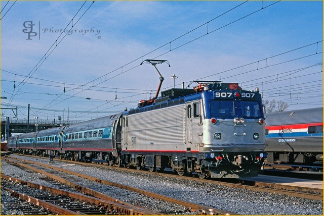
MJ's posted picture of an AEM7 with Amfleet cars dates from back around 2000
showing the ill-fated Acela Everything "blob" color scheme (the 90s "Northeast Direct" colors were much better) is a good example of a train side lines not matching.
I am in agreement that this mismatch - which could be an aerodynamic problem for
the train at speed - should be corrected in some way on the later train sets as they
are built...MACTRAXX
  • 1
  • 27
  • 28
  • 29
  • 30
  • 31
  • 111