by Blackstreet
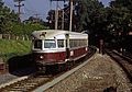
I miss way back when when the Kawasaki cars used to look like this...
http://www.nycsubway.org/perl/show?16715" onclick="window.open(this.href);return false;
http://orenstransitpage.com/wordpress/w ... ubsur1.jpg" onclick="window.open(this.href);return false;
and when the panel above the back doors on the side of the single-ended Kawasaki cars would look like this: http://planphilly.com/uploads/media_ite ... .360.c.jpg" onclick="window.open(this.href);return false;
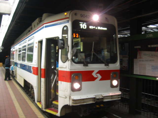
I was a kid when the trolley exteriors were painted that way and wish they still do today. I also miss the roll signs -- the plain white Helvetica text against a black or red background (or black letters against yellow). Even when the signs went digital in the 2010s, it would've been cool if they'd at least be the same exact font and color with the back, red, or yellow background but i remember i did a thread talking about the trolley roll signs a few years or so ago.
Anyway -- i would sell my right arm (not literally lol) to have only a portion of both the single- and double- ended Kawasakis painted like the pictures above because i miss those designs... as well as the way the single-end cars would have one window (by the back double doors i think) with the roll sign by it. You know what though, i remember two years or so ago, i was at 69th Street and while i was waiting for a bus, there just so happened to be a double-ended trolley with a roll sign on the window! I even stepped on the trolley and was playing with it too! I didn't get caught luckily but that was so nostalgic! I hope they didn't get rid of it and that is still there but i don't think so.
Does anyone else miss when they had the trolleys painted like that? Also I like when the stops used to look like this: https://justwestofphiladelphia.files.wo ... .jpg?w=300" onclick="window.open(this.href);return false;. I also miss when the 101 and 102 was the brown line and the 10, 11, 13, 34, and 36 was the green line.
http://www.nycsubway.org/perl/show?16715" onclick="window.open(this.href);return false;
http://orenstransitpage.com/wordpress/w ... ubsur1.jpg" onclick="window.open(this.href);return false;
and when the panel above the back doors on the side of the single-ended Kawasaki cars would look like this: http://planphilly.com/uploads/media_ite ... .360.c.jpg" onclick="window.open(this.href);return false;
I was a kid when the trolley exteriors were painted that way and wish they still do today. I also miss the roll signs -- the plain white Helvetica text against a black or red background (or black letters against yellow). Even when the signs went digital in the 2010s, it would've been cool if they'd at least be the same exact font and color with the back, red, or yellow background but i remember i did a thread talking about the trolley roll signs a few years or so ago.
Anyway -- i would sell my right arm (not literally lol) to have only a portion of both the single- and double- ended Kawasakis painted like the pictures above because i miss those designs... as well as the way the single-end cars would have one window (by the back double doors i think) with the roll sign by it. You know what though, i remember two years or so ago, i was at 69th Street and while i was waiting for a bus, there just so happened to be a double-ended trolley with a roll sign on the window! I even stepped on the trolley and was playing with it too! I didn't get caught luckily but that was so nostalgic! I hope they didn't get rid of it and that is still there but i don't think so.
Does anyone else miss when they had the trolleys painted like that? Also I like when the stops used to look like this: https://justwestofphiladelphia.files.wo ... .jpg?w=300" onclick="window.open(this.href);return false;. I also miss when the 101 and 102 was the brown line and the 10, 11, 13, 34, and 36 was the green line.