I NEVER advocated or intended to imply that the orange around the windows should stay.
The ONLY orange I intended would be the contrasting colors required for the handrails.
Since orange is FRA acceptable, I figured it made sense to use it for that, as well as a link to the steam engine and the centercabs.
It makes sense and I grasp what you're saying. I'm simply of the mind that the orange grab irons would not look at all good vs. dark green.
To stress again, I'm square in the corner of the old orange and black scheme; it's what I've always known and it's the way it always ought to be, if you ask me.
HOWEVER...since the A&A are going to reject, now, their 46 year old tradition in favour of a regentrification project of the coaches and combines by means of a new 'wardrobe' of Pullman green, then they should, first of all, do that much correctly. But why stop there?
Instead of ruining the look of the regentrified coaches by painting the grab irons orange in a misguided effort to match the trim of the locomotive and tender, it would be better if they went one step further and spruced-up the paint of the locomotive and tender, instead.
The orange lettering and trim of the locomotives made sense when the coaches were orange. In my humble opinion, 14 and 18 never looked so good as when they were glossy black with dark graphite smokeboxes and strutted about flashing their bright orange trim and whitewalls. But about 1995 or so, the joint chiefs of staff at the Orangegon deemed it meet to spoil 18's good looks with a silver smokebox (originally with
black fasteners around the door!), a silver firebox, orange grab irons, and white lettering, making it look like a crazy quilt of sorts. The overall look of the engine became very incongruous and rather difficult on the eyes.
The repainting of the coaches--as I see things, anyway--presents a golden opportunity for the Arcade & Attica to likewise dandify the locomotive with a proper paint job, finally correcting the mistakes of the past. In my opinion, that means saying goodbye to the orange grab irons and trim that no longer make sense. It also means repainting that tender: the off-center 'ARCADE & ATTICA' has always baffled me. It makes no sense at all and just looks as if somebody made a mistake, to be honest. The font, likewise, is unworthy (and completely incongruous).
If the styling cues of the past are being discarded for something new, let it be for something better. It would be a delight to see the train dressed to the nines this time around.
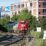
As far as something on the coaches to match something on the diesels...absolutely unnecessary. For one thing, the diesels are seldom paired with the passenger train and when they are, it's understood that they represent substitute motive power. The WWI-era coaches are naturally and properly paired with a steam locomotive. Secondly, they would have a common color link, in any case: black tops.

As for green/orange being a bad combination, might I point out the BNSF locomotive schemes as well as the original GN passenger car schemes, both of which use that exact color combination.
Ah, but did they use it in 1917? There's an era and a corresponding aesthetic to be borne in mind with respect to the equipment owned by the Arcade & Attica. The bold, flashy (or garish) color combinations of today's modern freight locomotives shouldn't be used as a guide by which to determine the color scheme of a very much more antique passenger train from a rather more genteel era having more conservatively refined tastes and sensibilities.