Railroad Forums 

Discussion relating to the Penn Central, up until its 1976 inclusion in Conrail. Visit the Penn Central Railroad Historical Society for more information.

Moderator: JJMDiMunno

 #933969  by carajul
 
I've always wondered who came up with the PC logo? I mean...it's like no effort was put into it. So cheezy. Just "Penn Central" in arial font under a stick figure of a P & C letters. I know the company was a disaster and the board was doing nothing but collecting huge chunks of money. Anyone know who came up with the logo and why such a cheap looking design was put into place?
 #934022  by scottychaos
 
"cheap looking" is very subjective..
and you are also looking at it with 40 years of hindsight and 40 more years of graphic design evolution..
we really cant judge old artwork on the standards of today..

I always kind of liked it, and im sure at the time it was considered quite "modern" and interesting..
personally, I have never considered it "cheesy" or "cheap looking"..

Scot
 #935580  by Allen Hazen
 
I don't dislike it, but comparing it to other railroad logos introduced in roughly the same era...
---I like the New Haven's McGinnis logo (N over H in block letters) better (o.k., it's a decade and a half earlier)
---the Illinois Central's rail cross-section split into I and C is wittier
---CN's worm initials are maybe the most comparable: I find it hard to choose between them
---None of them are anywhere near as good as British Rail's "railmark"
--
Note that PC in a way didn't WANT anything dramatic: they actually announced after the merger that the WEREN'T going to have a crash program to repaint locomotives! They wanted to re-assure investors that they were down-to-business, nothing extravagant, hard-nosed professionals. So maybe a simple logo, stenciled cheaply, projected the image they wanted.
 #957207  by Otto Vondrak
 
carajul wrote:I've always wondered who came up with the PC logo? I mean...it's like no effort was put into it. So cheezy. Just "Penn Central" in arial font under a stick figure of a P & C letters. I know the company was a disaster and the board was doing nothing but collecting huge chunks of money. Anyone know who came up with the logo and why such a cheap looking design was put into place?
Hm.

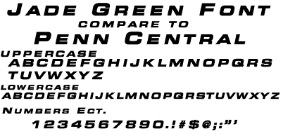
The "font" is not Arial, as you suggest. It is Eurostile Extended Bold Italic.
Image

Image

Arial's letterforms aren't even CLOSE, unless you consider they both contain a "bold" weight. I mean, hold them up side by side...

And to call the interlocking letters "stick figures?" What does that even mean?

I get that you're angry at something Penn Central Corp. did to you, but I think your critique may be a little flawed. Remember, we're looking back through the long telescope of time... This design came about in an era of diversified companies that were looking for simpler, modern logos to enhance their corporate image. Here are the good qualities about the logo:

1) Easy to read and recognize from a distance, able to reproduce cleanly at any size, from 1" to 10' tall. The logo should look good and read well whether it's embroidered on a conductor's lapel, printed on a timetable, applied to the side of a train, or flying on a flag over headquarters.

2) Can be reproduced in corporate color, or in black and white (newspaper ad, tv ads), and still communicate what it is. In other words, it doesn't depend on color to communicate, which, in an era of black and white advertising, was very important. Still true of the best logos today.

3) For a diversified corporation like Penn Central, the logo does not tie it to any one industry. Sure, we know it primarily as a transportation empire, but they were also heavily involved in real estate, energy, and other investments... Not unlike CSX and other modern railroads today.

Is it the prettiest thing in the world? Is it elegant? Attractive? I've never really thought about it that much. It represents the Penn Central Corp., that's all I know. I don't love it or hate it. You want to talk about ambiguous logos? How about the Conrail "can-opener" or the BNSF "swoosh" or CSX's "CSX" letterforms? The trend towards simpler forms and less expressive logos has been a trend for the last fifty years. Would Penn Central have stuck with that logo or maybe tried an evolution of its design had it continued past 1976? Hard to tell... Some logos age well over time, others do not.

-otto-
 #957490  by Noel Weaver
 
Unfortunately the Penn Central did not equal the Pennsylvania (Keystone) nor the New York Central (Oval) and the PC emblem of "two worms in love" was not up to the task either. Given the circumstances and conditions of this situation, I think the emblem fit, it was a historic period in railroading in the north east, a lot of things not only happened during the 8 and some odd years of Penn Central but a lot of things got their start during that period too.
Noel Weaver
 #957815  by umtrr-author
 
Though it would have violated item #2 in Otto's list, I think the Red P / White C version of the herald was pretty cool.

It didn't last long... I'm sure there could be any amount of speculation about why it didn't, but I suspect a key reason was cost.
 #958793  by motor
 
scottychaos wrote: I always kind of liked it, and im sure at the time it was considered quite "modern" and interesting..
Glad to see someone agrees with me. I always thought the logo conjured up speed and motion, not mating worms.

As for color variations, I prefer(red) the white PC on green.

motor
 #974106  by foxtrot
 
I liked the 2 worms in love. Remember everytime I saw the Red & White logo I shot a lot of film. 1st "superdetail" loco I ever did was an Athearn SD-45 after seeing one probably at the Selkirk shop/sand tower from the bridge that used to run over the yard by the hump
 #974705  by pbass
 
I liked the interlocked letters.It gave the company a new look which is what they had in mind.It looked more outstanding on the flanks with PENN CENTRAL spelled out.I still have conductor PC lapel pins in my collection and wear one on my winter coat.I find PC to be an attractive logo.
 #977001  by Dieter
 
If you think the logo is "Cheesy" or "Cheap", you must have thought the same of 50's deco design, because that's clearly where it's creation is rooted.

It was in Italics to promote the concept of SPEED. It was interlocked to promote UNITY between two corporations merged. It was SLEEK to evoke a sense of being MODERN and it was unique to promote itself as a new entity with a FUTURE.

That was what it was all about back then, a new company attempting to forge new image and move into the future, and that's about as far as it went. At the time, the word the majority of us used to describe what has become called the "Mating Worms" is/was "NEAT".

Now, without 40 years of hindsight, from the first time I saw it until this very moment, I think "VERIZON" is a stupid name for a company, and a lame trademark. If I live another 40 years, I will still feel that way.

D/
 #977542  by pbass
 
well said,dieter.even though we were bankrupt and operating on public monies,our logo instilled a bit of confidence that we might succeed.when i saw a passing train saying PC PENN CENTRAL,i had a good feeling about my contribution to the company's operations and it was a proud looking logo:much better looking and realistic than say a silly SLEEPY'S logo.railfans can criticise all they like,but i always will be fond of PC PENN CENTRAL.had the company more time to work together and put aside old time rivalries and truly work together as a team,the logo wouldnot be so controversial.companies that stay in business for long periods of time have a tendency to change their apperance,so the PC logo might have become dated.either way it is all moot of what was,and might have been.
 #977569  by Noel Weaver
 
pbass wrote:well said,dieter.even though we were bankrupt and operating on public monies,our logo instilled a bit of confidence that we might succeed.when i saw a passing train saying PC PENN CENTRAL,i had a good feeling about my contribution to the company's operations and it was a proud looking logo:much better looking and realistic than say a silly SLEEPY'S logo.railfans can criticise all they like,but i always will be fond of PC PENN CENTRAL.had the company more time to work together and put aside old time rivalries and truly work together as a team,the logo wouldnot be so controversial.companies that stay in business for long periods of time have a tendency to change their apperance,so the PC logo might have become dated.either way it is all moot of what was,and might have been.
I am not so sure that I can agree with all said on this one here. The Penn Central management allowed things to go bad with their foolish investments in some things other than railroad. They juggled the books to show that the outside investments were keeping the railroad running but I don't believe that one. They allowed the property to go downhill so bad that their operating costs skyrocketed. Main lines and important ones at that had mile after mile of 10 MPH and this resulted in many crews not being able to make it to their final terminal within the hours of service law, recrews cost lots of money. This also resulted in much more equipment than would have been needed if trains could run at track speed from one end of the railroad to the other. Derailments costs money, lots of it, and Penn Central had a lot of derailments, I saw several of them and rare was the ride on one of the remaining passenger trains that did not pass by a derailment scene with a lot of freight cars scattered about the landscape. Railroads can not make money when they operate in this fashion. Conrail proved that money could be made running railroads in the northeast, they fixed up the track, tore up what was not needed, bought new locomotives and instiled pride in the troops and MADE MONEY. I agree that passenger service was a drain but the Penn Central was relieved of practically all of the losses from this before the final collapse and yet it still collapsed. If you don't believe me, buy the book "The Wreck of the Penn Central", it will cover much more than I can here in few lines. I could say more about this one, lots more.
Noel Weaver
 #977635  by pbass
 
i've read Wreck of the PC many times.you and i have seen and experienced the truisms from what was said in that book.however,my intent is such,had we not gone broke so soon and were able to last privately,when all if not most of the old heads died or retired and new blood with the know how and determination to be sucessful not knowing the rivalry that existed before hand devoted themselves to the betterment of the company{the railroad part and nothing else},PC might have had a chance.but i still liked our logo anyway.
 #977639  by Noel Weaver
 
pbass wrote:i've read Wreck of the PC many times.you and i have seen and experienced the truisms from what was said in that book.however,my intent is such,had we not gone broke so soon and were able to last privately,when all if not most of the old heads died or retired and new blood with the know how and determination to be sucessful not knowing the rivalry that existed before hand devoted themselves to the betterment of the company{the railroad part and nothing else},PC might have had a chance.but i still liked our logo anyway.
OK
Noel Weaver