Unveiled today for the first time!
http://naphotos.nerail.org/showpic/?pho ... 489712.jpg
http://naphotos.nerail.org/showpic/?pho ... 295194.jpg
http://naphotos.nerail.org/showpic/?pho ... 231021.jpg
http://naphotos.nerail.org/showpic/?pho ... 026652.jpg
http://naphotos.nerail.org/showpic/?pho ... 821057.jpg
http://naphotos.nerail.org/showpic/?pho ... 816157.jpg
http://naphotos.nerail.org/showpic/?pho ... 157737.jpg
http://naphotos.nerail.org/showpic/?pho ... 011718.jpg
http://naphotos.nerail.org/showpic/?pho ... 215149.jpg
MEC407
Moderator:
Pan Am Railways — Boston & Maine/Maine Central — Delaware & Hudson
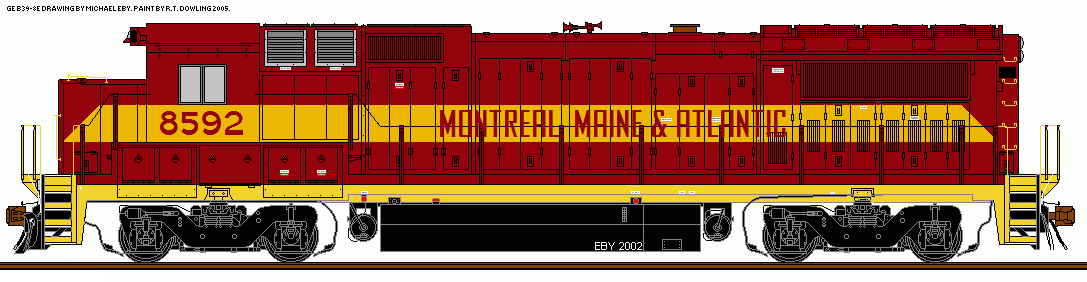
Central Maine & Quebec/Montreal, Maine & Atlantic/Bangor & Aroostook
Providence & Worcester — New England — GE Locomotives
Moderator:
Pan Am Railways — Boston & Maine/Maine Central — Delaware & Hudson
Central Maine & Quebec/Montreal, Maine & Atlantic/Bangor & Aroostook
Providence & Worcester — New England — GE Locomotives